

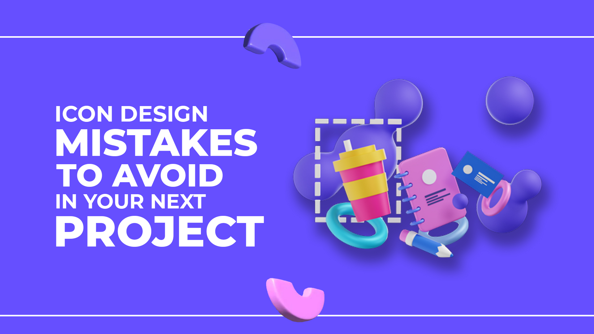
Icons often fly under the radar in design discussions, but they play a crucial role in user experience (UX). These small visuals act as silent navigators, guiding users through web pages and mobile apps. A well-designed icon can save time and reduce friction in an interface, while a poor one can lead to confusion and frustration.
Research consistently shows that visual cues like icons are processed faster than text. In fact, users are able to identify a visual symbol much quicker than reading a word or sentence. Icons serve as shorthand for actions and features, helping users understand the interface at a glance without needing to sift through lengthy descriptions.
However, even small icon design mistakes can disrupt the flow of your user experience. Icons that are unclear, inconsistent, or overcomplicated can confuse users, leaving them lost or frustrated. When designing icons, it’s crucial to get them right the first time to avoid turning what should be an intuitive process into an exercise in trial and error.
In this blog, we’ll explore common icon design mistakes and how avoiding them can help you create smoother, more intuitive designs that users will love.
Mistake #1: Overcomplicating Your Icons
Simplicity is the key to effective icon design. While adding intricate details may seem like a way to enhance clarity, excessive complexity often leads to confusion. In fact, research shows that users are less likely to engage with an interface if they struggle to recognize what an icon represents.
Icons should be clear and instantly recognizable. Overly detailed icons can become unidentifiable at smaller sizes, reducing usability. Think of a classic shopping cart icon—it’s a basic outline of a cart with wheels. There are no unnecessary embellishments, yet its meaning is immediately understood.
Tips for Effective Icons:
– Use simple shapes and minimal details.
– Ensure clarity at different sizes (test icons at small scales).
– Stick to universally recognized symbols.
– Maintain sufficient contrast for visibility.
Takeaway: Keep your icons clean, bold, and instantly recognizable. The goal is to communicate meaning at a glance, reducing cognitive load for users.
Mistake #2: Inconsistent Style Choices
Imagine navigating a website or app where each icon follows a different design approach, one is a minimalist line drawing, another is a detailed 3D render, and yet another is a colorful flat illustration. This inconsistency can make an interface feel unpolished and unprofessional.
When icons share a unified style, they blend seamlessly into the design, creating a smooth and intuitive user experience. Consistency in size, shape, stroke thickness, and color ensures the interface looks cohesive and intentional.
How to Maintain Consistency:
– Stick to a single design style (e.g., flat, material, outline, filled).
– Use uniform stroke widths and proportions.
– Follow a predefined color palette for all icons.
– Use a design system or icon library for consistency.
Icons with a consistent visual language help users quickly understand an interface. Just like reading a book with a structured layout, a cohesive icon set makes navigation more intuitive.

Mistake #3: Using Generic Icons
With the abundance of stock icons available today, it’s easy to default to generic designs. While they may be convenient, they often fail to communicate the specific function or purpose they’re meant to represent.
Users might recognize familiar icons like a standard “home” or shopping cart, but they won’t associate them with your unique brand or product. Generic icons lack personality, making your interface blend into the countless others on the web. As a result, they fail to create a memorable user experience or strengthen your brand identity.
Generic icons are like borrowed clothes—they fit, but they don’t tell a story.
Custom Icons for Branding
Custom icons aren’t just a design upgrade, they’re a branding tool. Thoughtfully designed icons can enhance your product’s personality and improve user engagement.
Consider a wellness brand using soft, flowing lines in its icons to convey calmness, or a tech startup using sharp, geometric icons to reflect innovation. These subtle choices help reinforce brand identity while improving usability.
The Fix
- Reflect Your Brand – Icons should align with your company’s tone (playful, professional, minimalist, etc.).
- Avoid Overused Symbols – Find creative alternatives to default icons while keeping them intuitive.
- Consider Functionality – Ensure custom icons are still instantly recognizable.
Mistake #4: Ignoring Accessibility and Contrast
Accessibility should never be an afterthought in icon design. Millions of people rely on assistive technologies such as screen readers, magnifiers, and high-contrast modes. If icons are not designed with accessibility in mind, they can become a major usability barrier.
According to the World Health Organization (WHO), over 1 billion people worldwide live with some form of disability. This makes digital accessibility an essential aspect of design, not just a best practice.
Contrast Isn’t Just Aesthetic, It’s Essential
Poor contrast can make icons difficult to distinguish, especially for users with low vision or color blindness. An icon that blends into its background is ineffective. High contrast ensures that icons remain clear and visible across all devices and lighting conditions.
– Use dark icons on light backgrounds (or vice versa).
– Test contrast with WCAG (Web Content Accessibility Guidelines) tools.
– Design icons that are distinguishable by shape, not just color.
Actionable Tips for Accessible Icons
✔ Meet WCAG contrast ratio guidelines – Use tools like WebAIM Contrast Checker to test visibility.
✔ Avoid relying on color alone – Differentiate icons using shapes and outlines for better clarity.
✔ Ensure size adaptability – Icons should be large enough to be distinguishable but not overwhelming.

Mistake #5: Failing to Adapt Icons for Different Screen Sizes
In the world of responsive design, one size does not fit all. Icons that look perfect on a desktop may become unreadable on mobile devices or too large for smaller screens. This scaling issue is one of the most common design mistakes, significantly affecting user experience.
When icons aren’t responsive, they either:
- Become too small on mobile, making them hard to recognize and tap.
- Appear too large on desktops, disrupting the visual balance of the design.
Neither scenario contributes to a seamless user experience.
How Scaling Affects Usability
Imagine trying to tap a tiny icon on your phone that hasn’t been scaled properly—it’s frustrating, right? Similarly, oversized icons can clutter the screen, making the interface feel chaotic. Poor scalability affects clarity, readability, and usability.
Best Practices for Responsive Icons
To ensure icons adapt well across different screen sizes, design with scalability in mind from the start. Here’s how:
– Use vector-based icons (SVGs) for smooth scaling.
– Ensure proportional resizing to maintain clarity.
– Adjust icon size and spacing dynamically based on the screen resolution.
– Test across multiple devices, from smartphones to desktop monitors.
For mobile users, icons should be large enough to tap comfortably but not so big that they dominate the interface.
Mistake #6: Ignoring User Testing and Feedback
Designing icons based purely on intuition is risky. While experience and creativity are essential, user testing ensures that your icons work in real-world scenarios. Feedback from actual users can uncover usability issues and help refine your design for better clarity.
Test, Don’t Guess
User testing provides concrete data that guides design decisions. It’s easy to assume that users will understand an icon the way you do—but that’s not always the case. A/B testing or usability studies can reveal:
– Whether users recognize an icon’s meaning immediately.
– If icons are clear at different sizes and contexts.
– Which designs perform best in real interactions.
Testing is like a compass; it points you in the right direction, ensuring you avoid unnecessary detours.
Refining Icons with User Input
Integrating user feedback throughout the design process ensures icons align with real user expectations. Collecting input early prevents confusion and allows designers to iterate based on real needs.
Practical Steps for Gathering Feedback
– Set up A/B testing to compare different icon versions.
– Conduct usability studies to observe real interactions.
– Analyze which icons users find most intuitive and refine them accordingly.
By actively involving users in the process, you create icons that feel natural, intuitive, and functional.
Best Practices for Designing Effective Icons
Tip #1: Follow a Design System
One of the most efficient ways to ensure consistency is by following a design system, such as Material Design or Apple’s Human Interface Guidelines. These systems provide predefined icon sets and guidelines for spacing, scaling, and alignment, making it easier to create visually cohesive icons across your app or website.
Tip #2: Focus on Function Over Fancy
While it’s tempting to create elaborate, intricate icons, it’s more important to prioritize function. Your icons should communicate clearly, without requiring users to guess what they represent. Keep designs simple and direct—this is what ensures usability and understanding at a glance.
Tip #3: Design for Every Screen and Every User
Test your icons across different screen sizes to make sure they’re legible and functional for all users. Also, prioritize accessibility by ensuring that your icons are easily distinguishable for those with color blindness or visual impairments. Always aim for a seamless experience, regardless of the device or user needs.
Check out our blog on Best Practices for Implementing UI Design Patterns to ensure your overall UI strategy aligns with usability principles.
Conclusion
Icons play a crucial role in user experience, acting as intuitive visual guides that enhance navigation and usability. However, common design mistakes—such as overly complex icons, inconsistent styles, and poor contrast—can create confusion rather than clarity. Ensuring that icons are simple, recognizable, and scalable across different devices helps users interact with your interface effortlessly. Prioritizing accessibility and maintaining a cohesive design language will make your icons more effective and user-friendly.
If you’re looking to refine your icons or improve your overall UI/UX design, our expert designers can help! With a strong understanding of user behavior and industry best practices, we create intuitive, visually appealing designs that enhance usability. Reach out to us for professional UI/UX design solutions tailored to your needs.
 From groundbreaking software to cutting-edge applications, we turn your ideas into reality.
 Our expert team crafts solutions that exceed expectations, boosting efficiency and solving real-world problems.
 Whether you’re a startup revolutionizing the market or an established enterprise, we’re here to fuel your success.


