Every interaction, whether it’s a scroll, click, or tap, influences a user’s experience. However, if these touchpoints aren’t executed thoughtfully, they can become obstacles, leading to frustration and discouraging further engagement.
Mastering UI design patterns isn’t just a good practice; it’s essential for the success of your designs. It’s what distinguishes outstanding designs from mediocre ones, ensuring a smooth and enjoyable user experience.
Don’t underestimate the importance of attention to detail in your designs. In this article, we will explore UI patterns, their significance, and showcase some commonly used patterns that contribute to satisfying user experiences (UX). Additionally, we provide resources for discovering and implementing these patterns effectively.
What Are UI Patterns?
UI patterns are pre-established solutions to recurring challenges in UI design. They serve as reusable building blocks that designers can leverage to address common interface design issues. While these patterns offer standardized solutions, designers must customize them to suit the unique characteristics and requirements of each interface. This customization ensures seamless integration with the overall user experience (UX) and alignment with project objectives.
Similar to UX patterns, UI patterns function as tried-and-tested strategies for creating intuitive and user-friendly interfaces. Instead of reinventing the wheel with each design iteration, designers can draw from a repertoire of established patterns that have proven effective in similar contexts.
The Impact of Effective UI Design Patterns
When applied effectively, UI design patterns streamline user interactions, eliminating guesswork and providing clear guidance on where to click, swipe, or input information.
This results in several positive outcomes:
- Intuitive Navigation: Users can effortlessly locate desired content, reducing frustration and enhancing satisfaction.
- Consistency: Familiar patterns create a cohesive experience across different pages, whether it’s a login form or a search bar.
- Increased Engagement: A comfortable and understandable interface encourages users to interact more, revisit the platform, and recommend it to others.
- Efficiency: Users can accomplish tasks more efficiently, leading to faster completion and fewer errors.
The Role of UI Kits and Design Systems
UI kits and design systems play a crucial role in ensuring consistency in UI design patterns. A design system acts as a comprehensive framework that guides the overall design and user experience, while a UI kit consists of pre-designed UI components that help implement the design system’s guidelines.
Selecting the appropriate tool, like Shipfaster 2.5: Figma UI Kit and Design System, can greatly improve your workflow. With frequent updates and a wide range of customizable components, you can easily create designs that stay up-to-date. Plus, you get lifetime access with a one-time payment!
Exploring Common UI Design Patterns
In UI design, there are no strict rules dictating how to design an interface. However, having a collection of design patterns available is incredibly valuable.
While these patterns aren’t strict guidelines, they provide useful insights and solutions based on industry best practices and user experience research.
Let’s explore some common UI design patterns to help you create modern, user-friendly interfaces.
Clear Call-to-Action
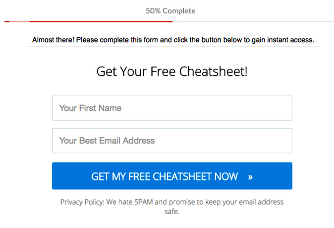
When designing web forms or interfaces with multiple actions, it’s crucial to ensure clarity in distinguishing between primary and secondary calls-to-action to prevent user confusion.
- Primary Actions: These actions should directly contribute to the completion of a form or task, such as clicking “Save” or “Send.”
- Secondary Actions: These actions typically do not lead to form completion and may include options like “Cancel.”
However, in scenarios where multiple options are presented in a single row, such as “Save,” “Save and Continue,” and “Publish,” it can be challenging for users to discern the primary and secondary actions.
To address this, UX designers should prioritize highlighting primary actions while de-emphasizing secondary actions. This can be achieved through:
- Visual Differentiation: Use different colors to distinguish primary and secondary actions, such as vibrant colors for primary actions and muted shades for secondary actions.
- Styling: Style primary actions as buttons and secondary actions as links, providing a clear visual cue for users.
Hamburger Button
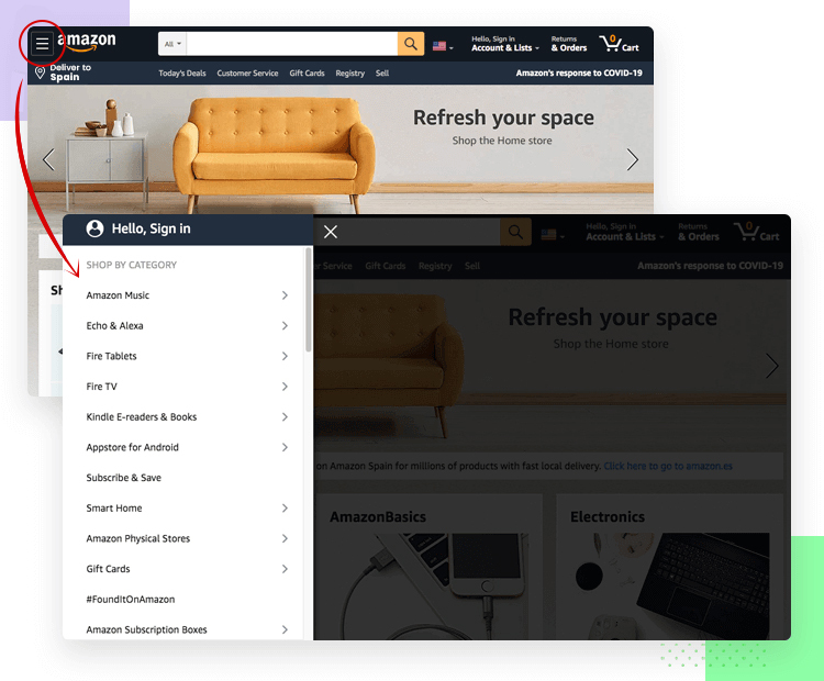
The hamburger button is a versatile UI design pattern used to address navigation challenges in limited-space scenarios. It condenses a website’s primary navigation into an icon consisting of three horizontally stacked lines. When users click or tap on the button, a menu of navigation links typically expands, providing access to various sections of the website.
With the increasing prevalence of mobile devices, hamburger buttons have become common in mobile web design. However, some websites also use this button style in their desktop view for streamlined navigation.
When implementing hamburger buttons for mobile devices, UX designers must ensure that the icon is large enough and clearly visible for users to interact with. Additionally, menu items should be spaced adequately to prevent accidental taps on incorrect links. It’s also essential to include functionality that allows users to close the menu without selecting any menu options, enhancing usability and user control.
Utilize Breadcrumbs
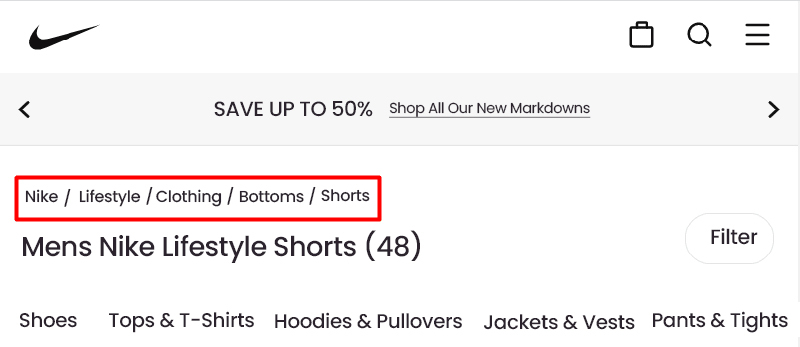
Breadcrumbs are a valuable UI design pattern that aids users in website navigation by providing a trail of links representing the path from the homepage to the current page. Typically positioned at the top of the page, below the header and above the content, breadcrumbs serve as secondary navigation elements, helping users understand the hierarchical structure of the website.
Each label in a breadcrumb trail is linked to its respective page or section in the hierarchy, except for the current page, which remains unlinked. This minimalist design pattern occupies minimal space and offers valuable contextual information to users.
It’s important to note that breadcrumbs should not appear on the homepage, as they serve no purpose in this context. Instead, they are most beneficial on deeper pages within the website, where users may need assistance in navigating back to higher-level sections.
File Upload
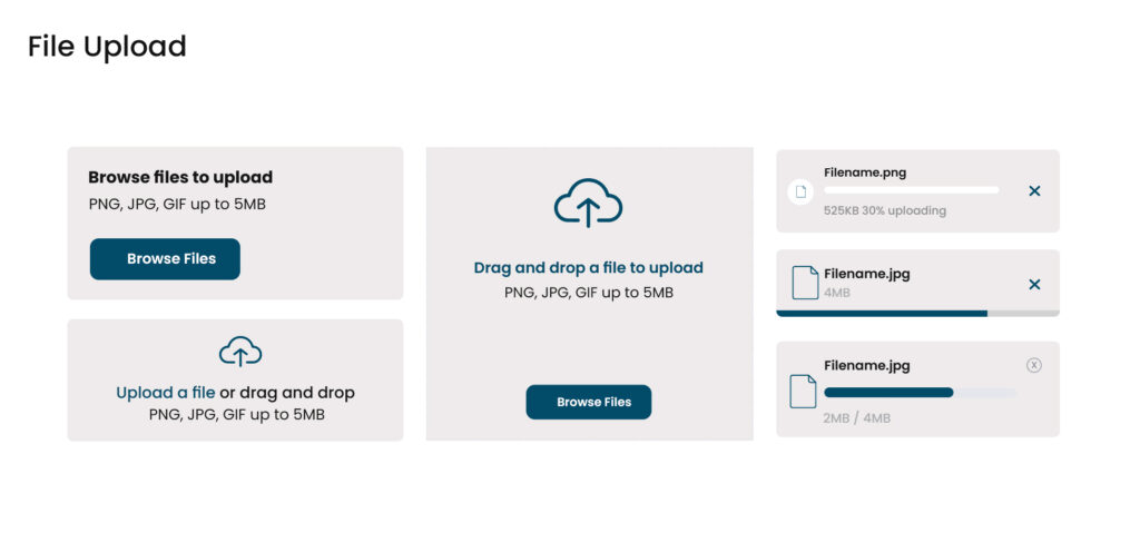
A file uploader is a fundamental component in user interfaces that facilitates the transfer of files from a user’s device to a server or cloud storage. Whether integrated within forms or presented as a standalone element, file uploaders streamline the process of submitting documents, uploading images, or attaching files to emails.
When to Use:
‒Submit Documents: Enable users to submit documents, forms, or other digital files securely.
‒Upload Images: Allow users to upload images, photos, or graphics to be shared or stored.
‒Attach Files to Emails: Facilitate the attachment of files to emails, messages, or other digital communications.
Types and States of File Uploads:
There are two primary types of file uploaders:
‒Default File Uploader: Users initiate the upload process by clicking a button to browse their device for files.
‒Drag-and-Drop File Uploader: Users can drag files directly onto the interface to initiate the upload process, offering a more intuitive and seamless experience.
Why it’s Useful:
File upload components streamline the process of transferring various file types, including photos, documents, or videos, from the user’s device to a remote server or cloud storage. By simplifying file addition, uploaders enhance user experience and make the upload process more intuitive and efficient.
Things to Keep in Mind:
‒Clear Labels and Descriptions: Provide concise labels and descriptions to inform users about file upload requirements, including size or format limitations.
‒Intuitive Drag-and-Drop Functionality: If implementing a drag-and-drop uploader, ensure the drop zone area is clearly marked with instructions for seamless interaction.
‒Display File Details and Progress: Show relevant details such as file name, type, size, and upload progress to keep users informed throughout the process.
‒Handle Long Filenames: Use ellipses (…) to truncate long filenames within the upload interface to maintain readability.
‒Include Supporting Icons: Utilize leading icons to indicate file types or provide visual cues that aid users in understanding the upload process more effectively.
Making Form Fields Mandatory
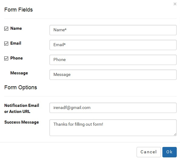
Ensuring clarity and intuitiveness in the user interface, especially with web forms, is crucial. One key strategy is to clearly mark required fields and alert users to the information they need to provide.
Emphasizing required fields reassures users that they only need to fill out essential information, rather than the entire form. It’s best to eliminate optional fields, keeping only the necessary information for user submission.
To enhance the overall user experience, simpler and shorter forms are preferable. Required field markers can be positioned next to labels for quick scanning or inside form fields for clarity.
When deciding which fields to make mandatory, consider the overall complexity of the form. If most fields are required in a complex form, users may perceive it as clutter. Therefore, it’s crucial to strike a balance and minimize unnecessary elements to optimize the user experience.
Pull-to-Refresh Feature
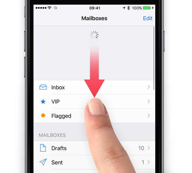
The pull-to-refresh feature allows users to update content on a mobile feed or webpage by simply pulling downward with their finger and releasing it. This intuitive gesture grants users greater control over their feed and ensures that they have access to the latest updates with minimal effort.
Due to its convenience and user-friendly nature, the pull-to-refresh concept has become a ubiquitous design pattern across both mobile websites and applications.
To optimize user experience, UX designers should implement a visible “refresh indicator,” such as text, icon, or animation, to signal when the refresh action is initiated. Additionally, designers should require users to pull the content downward past a predefined threshold to trigger the refresh, ensuring intentional user engagement. If the threshold is not met, the content should seamlessly return to its original position without triggering a refresh.
Infinite Scrolling Feed
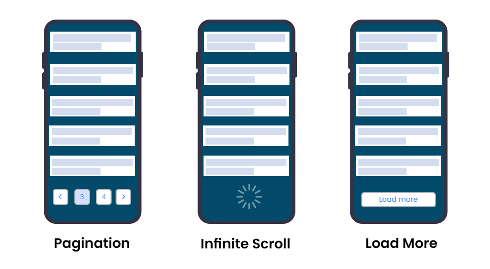
The infinite scrolling feed is a user interface feature that automatically loads new content within a website or app when the user reaches the bottom of the window. This creates a seamless and uninterrupted flow of content, enhancing user engagement while minimizing interaction costs.
Unlike traditional pagination, which divides content into multiple pages, infinite scrolling provides users with a continuous stream of content without the need to navigate to separate pages.
This UI design pattern is particularly effective on websites where users tend to explore without a specific piece of information in mind. It encourages prolonged browsing sessions by offering an endless supply of relevant content.
In addition to auto-loading content, infinite scrolling mechanisms often incorporate visual cues, such as animated icons, to indicate that more content is being loaded, keeping users informed and engaged.
Loader vs. Progress Bar
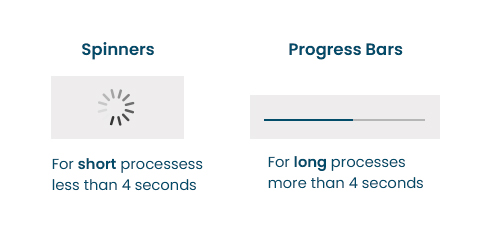
A loader is a visual indicator that informs users about an ongoing process, typically occurring in scenarios like data retrieval or content loading. It signifies to users that the system is working on their request. On the other hand, a progress bar displays the advancement of a process or journey, indicating how far along users are and how much more remains to be completed. It serves as a guide through multi-step processes, offering users clarity on their progress.
When to Use:
Loaders:
⟡
Initial Page Loading: When users first access a webpage or app, loaders reassure them that content is being loaded.
⟡
Data Retrieval: During tasks where data retrieval might take time, loaders indicate that the process is ongoing.
⟡
Processing User Actions: Actions like form submission or online transactions benefit from loaders to signify that the user’s request is being processed.
⟡
Media Content Loading: Platforms with heavy media content, such as photo galleries or video streaming sites, use loaders while images or videos buffer.
Progress Bars:
⟡
Guiding Through Processes: In scenarios where the duration of a process is known, progress bars guide users through multi-step tasks, showing both completed and remaining steps.
⟡
File Downloads: Progress bars are used to display the progress of downloading files from the internet, helping users track completion time.
⟡
File Transfer: Progress bars are utilized in applications where users transfer files between devices or servers.
Why They’re Useful:
Loaders and progress bars are essential for managing user expectations during time-consuming processes. They provide valuable feedback and information, keeping users engaged and informed about on-page actions. Loaders reassure users that their request is being processed, while progress bars help users understand the task’s duration and encourage commitment to completing it.
Things to Keep in Mind:
‒Minimize Display Time: Show loaders promptly to maintain a smooth user experience.
‒Provide Time Estimations: Inform users of how long they may need to wait.
‒Explain Delays: For loaders, clarify the reason for the delay to reduce user frustration.
‒Choose the Right Type: Utilize determinate progress bars for tasks with known durations and indeterminate ones for tasks with unknown durations.
‒Share Progress: Display the percentage or amount of progress to keep users informed.
‒Offer Context: Use labels and captions to provide additional information about the task or process.
Hover Interactions

Hover Interactions provide users with additional information or functionality when they hover their cursor over a specific element. Rather than overwhelming the interface with excessive information, this pattern reveals details dynamically as users interact with elements, enhancing the user experience without cluttering the interface.
This pattern can be implemented through tooltips, pop-ups, or dynamic previews, and is commonly employed in image galleries, navigation menus, or data visualization components. By providing contextual information on demand, Hover Interactions streamline the user experience Five Popular UI Pattern Libraries
Button
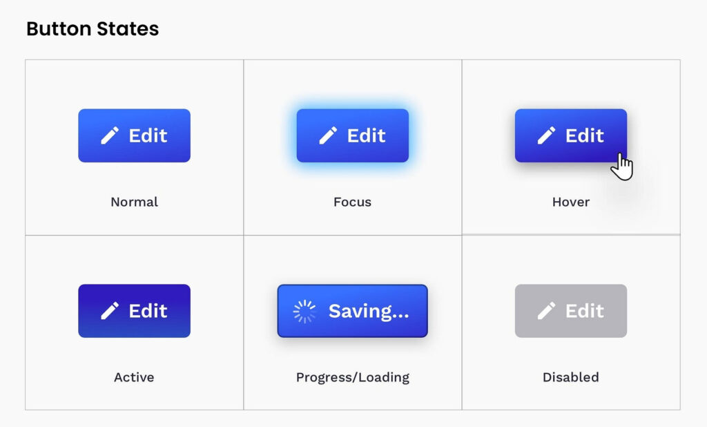
A button is a fundamental element in user interface design, serving as a trigger for specific actions based on user interaction. These actions can range from navigating through a website to submitting a form or initiating a search query. Buttons are versatile and play a crucial role in guiding users through the interface by highlighting essential actions they can take.
Why it’s Useful:
Buttons serve as clear prompts for users, directing them toward key actions and interactions within the interface. Whether it’s prompting users to sign up, proceed to the next step, or trigger a search, buttons provide clarity and facilitate smooth user journeys through the interface. Identifying the right style and placement of buttons is essential for an effective user interface design.
Things to Keep in Mind:
‒Understand the Button’s Role: Each button should have a distinct function, whether it’s primary, secondary, or tertiary. Understanding the purpose of each button influences its design and placement within the interface.
‒Determine Visual Importance: Primary actions require more prominent buttons, while secondary actions can be more subdued. Organizing button hierarchy based on importance ensures users can easily identify the most critical actions.
‒Consistency: Maintaining consistency in button design, including color palettes, icon styles, and typography, enhances the overall user experience and reinforces familiarity.
‒Provide Feedback: It’s crucial to provide visual feedback when users interact with buttons, indicating that their action has been acknowledged. This can include subtle changes in color or size to signify interaction.
Top UI Pattern Libraries
Here are some of the top UI pattern libraries where you can discover the previously mentioned design components for your upcoming UI projects:
- Material Design (Developed by Google): Material Design is an open-source design system that offers comprehensive design guidelines, system updates, news, resources, and UI design patterns. It follows accessible, modern, and visually appealing design trends. UI patterns are categorized based on their purpose, including action, containment, communication, navigation, selection, and text input.
- Material-UI: Material-UI is a robust UI pattern library tailored for React components, adhering to the Material Design Guidelines by Google. With over 40 pre-built UI patterns and building blocks, Material-UI allows for easy customization and integration into web applications. Plus, it’s free to use!
- Carbon Design System (Created by IBM): Carbon Design System, an open-source UI library from IBM, offers a comprehensive set of reusable components, patterns, and guidelines aligned with IBM’s design principles. It boasts a vibrant community of contributors open to questions and ideas, ensuring ongoing support and innovation.
- Fluent UI (Previously Office UI Fabric by Microsoft): Fluent UI, formerly known as Office UI Fabric, is a UI library developed by Microsoft. It features a diverse collection of components and design patterns consistent with Microsoft’s Fluent Design System. Suitable for various web and mobile platforms, Fluent UI delivers a modern and consistent user experience across different devices.
- Ant Design: Ant Design is a widely acclaimed UI library renowned for its well-designed components and patterns tailored for building enterprise-level applications. Following a minimalist and modern design language, Ant Design provides extensive documentation and examples to facilitate straightforward implementation.
These UI pattern libraries offer a wealth of resources and tools to streamline the UI design process and ensure the creation of user-friendly and visually appealing interfaces.
UI Patterns Key Takeaways
UI patterns serve as invaluable tools for creating intuitive and user-friendly interfaces, offering reusable solutions to common design challenges.
Incorporating UI patterns into your designs can lead to time savings, improved usability, and enhanced overall user experience.
While UI patterns provide valuable guidelines, they should not be followed blindly. Each design project is unique, requiring customization to suit specific contexts and user needs.
User research and testing are essential steps to inform design decisions and ensure optimal outcomes.
If you require assistance with UI design or have questions about implementing UI patterns, consider contacting top UI/UX design agencies for expert guidance and support.
