

Let’s suppose you’re eager to go on a long drive and explore new horizons. But as you leave your city, you encounter a damaged route with cracks and obstacles, where every turn tests your patience with a new challenge. After enduring this weary journey, finally reaching your destination, how would you feel? Now, imagine this scenario mirrored in the digital world. Users venture on their journey by visiting your website, seeking information, products, and services. However, instead of a smooth ride, they find themselves in a forest of confusion where every step presents a new challenge, similar to what you experience while driving.
Both scenarios evoke the same feelings like frustration, weariness, and uncertainty. That’s why navigation design is considered a foundational element of UX design. A proper navigation system empowers users to interact with and use your products seamlessly. It can significantly impact users’ journeys and shape their attitudes toward your brand. To ensure an enjoyable user journey, carefully examine every step and understand navigation design thoroughly.
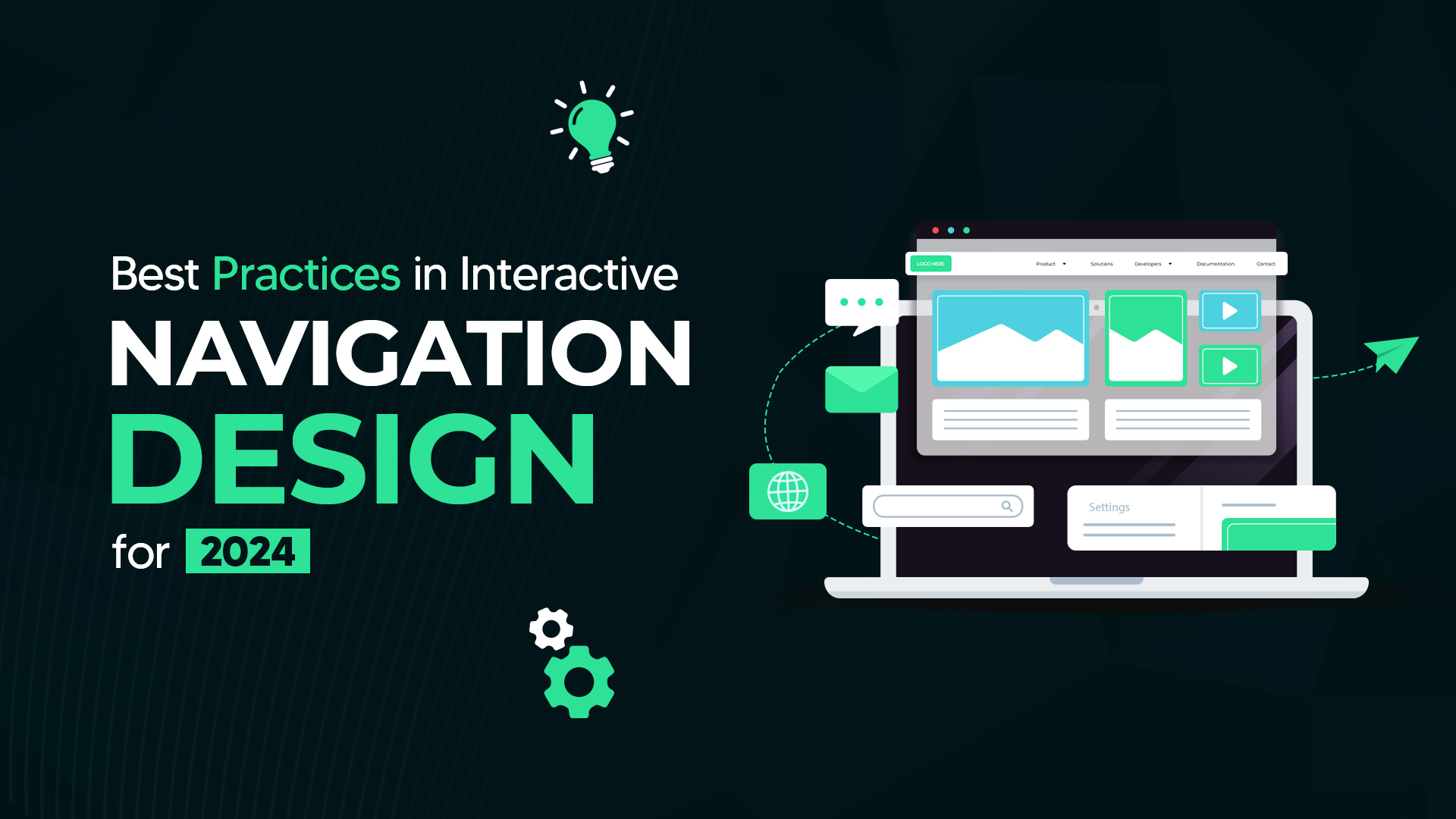
The Fundamentals of Navigation Design
Navigation design is an essential aspect of the user interface (UI). It involves creating and implementing systematic ways for users to move through your website or application. It effectively guides your users on where they are, what they can find, and how they can find it. A well-designed navigation system significantly improves the user’s experience, reduces friction, promotes usability, and enhances the user’s satisfaction with your products and services.
Is it necessary to design systematic navigation?
A well-structured, well-designed, and well-organized website facilitates users’ movements through the platform. It enables users to find what they are looking for and take desired action.
Furthermore, it is important for:
★Search engine optimization
★Pleasant user experience
★Optimization of the conversion rate
★User-centric navigation design
★Enhancing products’ credibility
The Key Principles of Effective Navigation Design
Navigation design is vital for driving your brand’s success by lifting the user experience positively. Designing an effective navigation system involves the following key principles.
❖Keep Consistency and Simplicity
Consistency and simplicity are the cardinal rules of effective navigation design. Users should not experience the complexity of navigation on your website or application menus. Keep your navigation bar clear and concise. Use straightforward language for users to get information easily. Ensure the continuity element to maintain uniformity throughout the platform and avoid confusion.
Consistency is the heartbeat of every great game
Hierarchical Structure of Information
Architecting an information hierarchy simplifies users’ navigation on your website and helps them move effortlessly. Prioritize the information hierarchy, and make it understandable for users to navigate through content and reach the final destination. Assemble all useful information in the menu bar, use headings, and subheadings, and divide categorically. Also incorporate visual cues like color variation, spacing, and indentations.
Explore the hierarchical arrangement of a site:

Mobile-Friendly and Responsive Design
It is also a significant portion of improved user experience. The world is in the lap of the smartphone era. Design your navigation system adaptable to various screen sizes. Make your website navigation system mobile-friendly by incorporating features like collapsible menus, swipe gestures, and hamburger icons.
Characteristics of a mobile responsive website:
★Adaptable to all devices
★Fast loading speed
★Efficient and effective design
★Having tapping and clicking quality
Responsive website having the capacity to accommodate itself for all resolutions regardless of size:

Integrated Search Functionality
Introducing a search bar for instant, effortless access to information can revolutionize the game. How effectively can you customize your navigation system? Even with a well-structured navigation setup, users often prioritize searching for information rather than spending time scrolling through pages. Prominently integrated search functionality enhances your brand’s credibility and excellence in user experience.
Benefits of the Search Bar:
★Facilitate easy navigation
★Improve users’ satisfaction
★Increase the conversion rate
❖Visual Cues and Confirmation
It is very important to guide your users throughout the platform. To ensure this purpose, use visual cues; these are like a traffic sign on the road which enables users to direct their navigation safely. It can be in different forms like arrows, contrast, colors, buttons, textures, icons, hover effects, and feedback messages. It makes users’ navigation more effective and enjoyable.
Additionally, confirmation alerts are essential in navigation layouts to ensure users’ movements are intentional and prevent accidental interactions. Confirmation messages serve as safeguards before performing significant actions, for instance deleting a file or making a purchase.
Familiar Patterns in Traditional Navigation Design
Many mechanisms exist to better your user experience. It depends on the product which one suits you better. For many products, it can be used in combination. For instance, a breadcrumb is favorable for e-commerce business websites along with hierarchically structured categories.
Go through the common navigation designs widely used in UX:
- Hamburger Menu
It is the gateway to information, explosively popular since the last decade, particularly on smartphones. The hamburger menu typically features three stacked lines indicating the hidden menu. When the user taps on it, the menu either opens like a drawer or displays all relevant navigation items or elements.

- Vertical Navigation
Typically it is found on the left-hand side of screens. It seems like a stretched component on the left side of the page. It links various pages and parts of a website. It helps to display classified primary, secondary, and tertiary items.
It seems like:

It is very easy to scan and locate plus it has larger space as compared to horizontal navigation which eases adjusting links, options, and items. If you prioritize horizontal navigation means to design a specific version while in the vertical menu, you have to just adjust the width for the required size.
- Footer Navigation
The footer is also a content portion, usually involving policies, social networking, logo, contact information, and sign-up elements at the bottom. It contains information that increases the overall usability of a site. Also, enhances the user experience by providing clean navigation.
Convenient footer navigation eases the user’s engagement. This bottom-oriented navigation bar is ideal for e-commerce businesses and news websites.
Understand with a visual reference at the CNN news site:

- Breadcrumbs
Breadcrumb navigation is a secondary navigation scheme, located just below the top menu. Inspired by the Hansel and Gretel story. Breadcrumb navigation is beneficial for a heavy content-rich e-commerce website having hierarchical groups and logical categories of a large variety of products. It is a very convenient feature of the website which provides an alternate route for the user’s navigation. It should be regarded as an extra feature rather than replaced with a primary menu.
Let’s consider the breadcrumb navigation bar of the following Italian dance school known as Rome International Dance Academy.

- Call-to-action Buttons
Known shortly as CTA buttons, these buttons serve as signposts for users on websites, directing them on what to do next. They grab users’ attention and guide them to take action or navigate from one page to another, encouraging a step-by-step exploration of your site. For instance, imagine a reader engaged in your content, now inspired to purchase your product. Without clear direction on what to do next, how will they reach you?
Call-to-action buttons act as motivational prompts for audiences to take action with a simple click. They confine actions such as signing up, making a purchase, downloading, sharing, or learning more.
CTA buttons must be positioned strategically, where they can easily be noticed. They can be added at the end of product descriptions or displayed at the top of the landing page. This eases the decision-making process for users by enhancing their engagement and, ultimately, the conversion rate.
Practical Tips for Streamlining Navigation Design
How can you design the best navigation system? You learned why a navigation design is important but to make it victorious, understand the following guidelines:
Tip #1: Promote Clarity
Clear and descriptive labeling of menu items is crucial for helping users understand where they are and where they can go within your website or application. Ensure that menu labels are consistent, descriptive, and succinct to avoid confusion and frustration. Consistency in design elements and terminology across the navigation system will also aid in making navigation intuitive for users.
For example, if you’re designing a navigation system for a museum website and want users to easily access the “collections” page from the landing page, prominently label it in the navigation bar. This makes it easy for users to find and navigate to the desired section without having to search extensively.
Just like the Musée d’Orsay (Museum in Paris) page, see:

Tip # 2: Prioritize Mega Menu
Mega menus are expansive navigation menus that display multiple options at once, typically organized into categories or groups. Unlike traditional drop-down menus, mega menus provide a larger surface area for navigation options, making it easier for users to find what they’re looking for without excessive scrolling or clicking.
A well-organized mega menu divides content into logical groups, making it easy for users to locate specific information quickly. You can take the example of a well-known brand Adidas navigation page.

Additionally, it’s important to recognize that drop-down menus may not be suitable for mobile devices due to their reliance on hover interactions, which are not supported on touchscreens. Mega menus provide a more accessible and user-friendly alternative for mobile navigation.
Tip # 3: Goal-Oriented Navigation
Aligning navigation design with users’ goals is essential for creating a user-centric experience. Understanding user personas and their primary objectives allows designers to structure navigation systems that cater to users’ needs effectively.
Various UX research techniques, such as creating personas, asking targeted questions, and analyzing user scenarios, can help identify users’ goals and priorities. By addressing these goals through intuitive navigation design, designers can enhance the overall user experience and increase user satisfaction.
For instance, James Kalbach’s questioning techniques for website navigation design focus on addressing users’ concerns and objectives, such as:
★How can I contact the website owner?
★How do I know the information is up-to-date?
★Is the site’s content trustworthy?
Tip # 4: Test Your Design
How do you know your design is effective? The best way to create a productive design is to test it and ensure it is effective. Design and use different navigation bars to find which one provides the best user experience.
How can testing help you?
Prototyping is a useful technique that helps you understand your products, users’ needs, and the effectiveness of your design. It also guides the direction of your products. Prototyping can help improve your site’s signup flow and purchasing flow, enabling you to test different versions and select the best one for navigation design.
Tools like Crazy Egg, UserTesting, and Hotjar can enhance your ability to design or prototype navigation flows and help you gather the necessary data.
Conclusion
It is essential to create a cohesive and consistent navigation environment for users’ preferences. It requires you to align your users’ goals and strategic path along with the navigation design. Conduct systematic research to address all of your navigational issues, understand users, and choose experts to overcome your problem. Prioritize users’ satisfaction, freedom, and control, and let them roam around the user interface with ease.
As a user, how would you prefer to have freedom and control over navigation?
 From groundbreaking software to cutting-edge applications, we turn your ideas into reality.
 Our expert team crafts solutions that exceed expectations, boosting efficiency and solving real-world problems.
 Whether you’re a startup revolutionizing the market or an established enterprise, we’re here to fuel your success.


