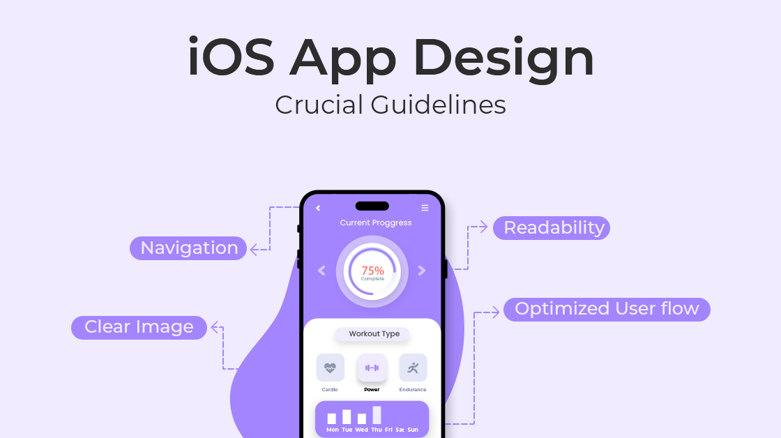

When it comes to creating a successful iOS app, it takes more than just coding and visuals. It’s all about achieving a perfect balance between user experience and aesthetics. Ideally, you want your app to become an integral part of your users’ daily lives, seamlessly aligning with their expectations. Achieving this requires adherence to fundamental guidelines that shape not only the app’s look but also its feel. In this article, we explore the key principles that can transform your app into an extraordinary and captivating digital masterpiece. Whether you’re a developer, designer, or simply an app enthusiast, come with us on this journey to unlock the secrets of crafting iOS apps that resonate deeply and engage effortlessly.
Adherence to Apple’s Human Interface Guidelines
Creating great iOS applications goes beyond just making them look good. To truly succeed, you need to provide a user experience that works seamlessly with the iOS platform and resonates strongly with your users. This is where Apple’s Human Interface Guidelines (HIG) come in. These guidelines provide more than just suggestions; they offer a clear path to crafting apps that feel like they truly belong within the iOS ecosystem. By following the HIG, you’re not just building an app; you’re creating an experience that users will truly enjoy.
Controls that Speak to Users
Controls serve as the crucial link connecting users with your app’s functionality. In this context, Apple’s Human Interface Guidelines (HIG) provide invaluable direction for employing controls optimally.
An illustrative example lies in the use of switches and sliders. Switches, akin to the on/off toggles prevalent in device settings, offer users a seamless means of navigating binary settings. As endorsed by the HIG, these switches provide an intuitive and recognizable way to manage such options. Conversely, sliders emerge as a user’s ally when dealing with values spanning a range. Imagine the gratification of effortlessly sliding control to achieve the precise volume level you desire. This tactile interaction, advocated by the HIG, enhances user satisfaction and engagement, underscoring the impact of well-implemented controls in an app’s design.
Typography and Color
Typography and color are silent influencers in the world of design, setting the tone for user experience. Apple’s HIG directs you on how to harness these influencers:
Central to this approach is the San Francisco font. Beyond being just another font choice, it serves as a strategic tool to maintain legibility, even in the smallest text sizes. The result? A user encounter characterized by clarity and crispness elevates the overall interaction quality.
Color, another indispensable facet, emerges as a covert yet potent force for directing user attention. The HIG advocates a judicious application of colors, reserving them for specific roles such as highlighting interactive elements. Imagine the impact of employing the perfect color to entice users toward action buttons or crucial alerts. This strategic use of color subtly guides user behaviors and choices, amplifying the overall usability of the application. Through the guidance of the HIG, you can harness these unseen influencers to craft an interface that resonates with users and contributes to an exceptional user journey.
Deference and Depth
Embedded within Apple’s design philosophy is a foundational tenet: the interface should never overshadow the content it presents; instead, it should magnify its significance. This philosophy is encapsulated by the principle of “Putting Content First.” Visualize an app where your photos command the forefront, unburdened by superfluous design elements that might dilute their impact. This embodiment of the principle of difference empowers your content to radiate, culminating in a user experience that seamlessly merges engagement with intuition.
This commitment to prioritizing content extends beyond the visual realm and delves into the experiential realm through the concept of depth. In this context, depth surpasses the confines of mere visual representation; it engenders immersive engagement. Envision shepherding users through your app as if they were navigating a tangible, three-dimensional space. This immersive depth accomplishes more than establishing a hierarchical arrangement; it fosters an experiential journey. It’s a journey where users are seamlessly guided through strata of information and interaction, forging an interface that resonates as not just utilitarian, but vibrant and dynamic. Apple’s design philosophy, exemplified through these concepts, underscores the indispensability of crafting interfaces that not only serve as conduits for content but also transmute into immersive experiences in their own right.
Remember to embrace HIG you’re not just creating an app, but also a valuable user experience that will keep them coming back.
Consistency: Crafting a Unified User Experience
In the realm of iOS app design, consistency isn’t just a buzzword; it’s the cornerstone of a seamless and intuitive user experience. Think about it: When users navigate through your app effortlessly, understanding how it works and what to expect, that’s the result of a consistent design approach. Here’s how consistency becomes the secret ingredient that transforms an app from good to exceptional:
Typography and Color Consistency
Imagine walking into a house where all the rooms match pleasingly. This idea also works for digital stuff, like apps. When you use the same fonts and colors consistently on all screens, it’s like inviting users to a place they recognize.
By keeping the fonts and colors similar, you create a nice and easy-to-understand look. Just like how Twitter uses the same fonts and colors for words, your app can also feel friendly and connected. Just like a well-arranged house feels cozy and put together, your app, with its careful choice of fonts and colours, can make users feel comfortable and understand things easily.
Interaction Consistency
Think about it like this: When you use a familiar road to get to work every day, you know what to expect – which turns to make, where the stop signs are, and so on. This predictability helps you navigate comfortably without having to think too much. Similarly, in an app, when users can predict what will happen when they take an action, they feel more in control and confident.
For instance, consider the example of an email app. If swiping left is consistently associated with deleting messages and swiping right is always linked to replying, users quickly learn this pattern. Just like how we trust that turning the steering wheel right will make the car go right, users trust that their actions in the app will yield the expected outcomes. This kind of consistency empowers users to explore and interact without hesitating because they know what to expect.
By ensuring interaction consistency, you’re essentially giving users a road map that they can confidently follow within your app. This not only enhances user satisfaction but also reduces confusion and makes their overall experience smoother.
UI Element Consistency
Think about driving a car where the brake pedal and accelerator switch places every single day. It would be chaos, wouldn’t it? Similarly, in the world of apps, UI element consistency plays a vital role in providing a dependable experience:
This consistency ensures that users can expect the same actions from the same elements, no matter where they are within the app. For instance, consider Instagram – regardless of your current location in the app, tapping the home icon consistently leads you back to your feed. This kind of UI element consistency assures users that they’re never disoriented and can always retrace their steps. Just as a reliable map guides you on the road, UI element consistency acts as a reliable guide within your app, making navigation intuitive and frustration-free.
Consistency with iOS Design Patterns
Just like how every captivating story adheres to a certain pattern, successful iOS apps also adhere to well-established iOS design patterns. These patterns act as the threads that tie users to your app:
Consider the tab bar as your user’s reliable guide, standing ready to assist them in effortlessly navigating your app. Just as the App Store app employs a tab bar for smooth navigation, your app can seamlessly align with these recognized iOS design patterns. This alignment provides users with a sense of familiarity and makes their interaction with your app more intuitive, as they can rely on the patterns they’ve encountered in other apps. Much like a familiar road sign on a journey, these design patterns serve as signposts that guide users through your app’s landscape.
Consistency is not a constraint, but rather an ally in crafting an iOS app that users will embrace, enjoy, and return to with ease and familiarity.
Clarity: Illuminating the Path of User Interaction
In the vast landscape of app design, clarity is your guiding star. Imagine creating an app where users can seamlessly navigate, understand, and interact without stumbling upon confusion. That’s the magic of clarity. Let’s explore how you can infuse clarity into your iOS app design, making it a beacon of user-friendliness:
Legible Typography
Picture reading a story where the font size changes with each page. Frustrating, right? Legible typography is your compass in the sea of design. Think of the Apple Notes app – it wields the San Francisco font like an expert, ensuring that the text is not just readable, but also inviting, even in those tiny sizes. It’s about inviting users to read effortlessly, without squinting or straining their eyes.
Clear Visual Hierarchy
Imagine entering a room where everything is equally highlighted, competing for your attention. Chaos, right? Visual hierarchy is your secret sauce for guiding users’ attention. Think about the Contacts app – it masterfully showcases contact names in bold, prominent text while presenting contact details in a composed, understated manner. This visual hierarchy beckons users to focus on what matters most.
Clear Labels and Instructions
In a world of jargon and complexity, simplicity reigns supreme. Think about the iOS Settings app – it’s a testament to the power of clear labelling. Each setting is accompanied by concise, straightforward language that leaves no room for confusion. It’s about empowering users to understand the purpose of each feature without needing a dictionary or a guidebook.
Unambiguous Icons and Symbols
Imagine encountering a maze of unfamiliar symbols, each leading you to an uncertain destination. The iOS Camera app flips this scenario on its head. It embraces universally recognized symbols, such as the camera with circular arrows, to signal the switch between front and rear cameras. This approach ensures that users don’t just see icons; they instantly understand their purpose.
When clarity is scarce, your app becomes a beacon of understanding. A haven full of user-friendliness, empowering users to master their digital journey.

User Control: Empowering the Journey of Interaction
In the ever-evolving world of iOS app design, achieving clarity is paramount. This principle centers on creating an interface that users can effortlessly navigate, understand, and interact with. By prioritizing legible typography and establishing a clear visual hierarchy, you can elevate the user experience and ensure your app is a pleasure to engage with.
Legible Typography
Imagine reading a captivating book printed in an illegible font. Just as poor typography can hinder a reading experience, it can also impede user interaction in an app. Legible typography is the cornerstone of a user-friendly interface. The choice of font, size, spacing, and contrast directly affects how easily users can digest information presented on the screen.
When users encounter text that is easy to read, it not only enhances their comprehension but also reduces cognitive load. The iOS ecosystem relies heavily on the San Francisco font for its clarity and readability, especially in smaller text sizes. This font maintains its crispness across various devices, ensuring that users can effortlessly engage with content without straining their eyes.
Clear Visual Hierarchy
Imagine walking into a room where everything is equally emphasized and competing for attention. This chaotic scenario is analogous to an app interface lacking a clear visual hierarchy. Visual hierarchy is the strategic arrangement of design elements to guide users’ focus and understanding. It ensures that users instinctively grasp the relative importance and relationships among different elements on the screen.
By establishing a clear visual hierarchy, you direct users’ attention to essential information and actions. For instance, consider an e-commerce app’s product page. A well-designed hierarchy would prominently display the product name, price, and “Add to Cart” button, while less critical details might be presented more subtly. This helps users quickly identify key information and aids decision-making.
Straightforward Labels and Instruction
Imagine trying to assemble furniture without clear instructions. Similarly, an app without straightforward labels and instructions can leave users bewildered. Clear labelling is the linchpin of user comprehension. It involves using concise and easily understood language to describe functions, options, and actions within the app.
When users encounter labels and instructions that are succinct and intuitive, they feel confident in navigating the app. This is particularly important for features that might be unfamiliar or complex. Consider a weather app that provides detailed weather forecasts. If it uses jargon or unclear labels, users might struggle to interpret the information. However, with straightforward labels like “Today’s Forecast” or “Hourly Details,” users can quickly grasp the app’s offerings.
Venture into iOS app design, remembering user control isn’t just a feature; it’s honoring autonomy. Actions matter, preferences are valued, and their journey is guided by their hands. With elusive control, your app empowers users, guiding them toward an unforgettable experience.
Feedback and Responsiveness: Elevating User Interactions
Imagine a conversation where your words vanish into thin air, leaving you wondering if you were heard. That’s precisely how interactions in an app can feel without proper feedback and responsiveness. Welcome to the world where every touch, swipe, and tap matters. Let’s embark on a journey through techniques that breathe life into your app interactions, creating a symphony of user engagement:
Responsive Feedback
Imagine playing a musical instrument that doesn’t produce sound when you press the keys. Responsive feedback in an app is akin to the music that emanates from the instrument, establishing a connection between users and their actions. This feedback can take various forms, including haptic vibrations, sound cues, and visual changes.
Haptics, in particular, has gained prominence as a subtle yet effective means of interaction feedback. Consider the sensation you feel when scrolling through a list or tapping a button on your device. These haptic responses provide a tactile confirmation of your actions, making the interaction more tangible and engaging.
Showing Progress
Imagine watching a loading screen with no indication of progress. Waiting becomes frustrating and uncertain. Displaying progress in an app is like offering a progress bar during a journey – it keeps users informed and engaged. When users initiate actions that require time, such as uploading a file or loading content, a visual representation of progress, like a loading spinner or progress bar, assures them that something is happening in the background.
The perception of time passing quickly is greatly influenced by providing users with a sense of progress. For example, consider an app that uploads images to a cloud server. Without a progress indicator, users might become impatient and frustrated. However, with a clear loading bar that advances steadily, users feel more patient and confident that their request is being processed.
Effective Error Handling and Confirmation
Imagine sending an email and wondering if it was sent. Effective error handling and confirmation messages eliminate this uncertainty. When users encounter errors or perform critical actions, such as deleting data, providing concise and clear error messages or confirmation dialogs is vital for maintaining user trust and clarity.
Error messages should not only inform users of what went wrong but also guide them toward a solution. For instance, if a user tries to submit a form with incomplete fields, the app should display an error message indicating the specific fields that need attention. Similarly, when users take irreversible actions, like deleting a file, a confirmation dialog should appear, requiring them to confirm the action. This prevents accidental mistakes and empowers users to make informed decisions.
Every interaction is an opportunity to communicate. Feedback and responsiveness affirm users’ impact, acknowledging concerns, and guiding journeys. Amid limited attention, your app exemplifies comprehension and engagement, beckoning users to confidently interact.
Accessibility for All: Inclusive Design for Diverse Users
In the landscape of iOS app design, inclusivity is more than a buzzword—it’s a commitment to ensuring that all users, regardless of their abilities, can engage with your app seamlessly. Accessibility features are the cornerstone of this commitment, bridging gaps and providing a tailored experience to users with diverse needs. By prioritizing logical layout, dynamic text, and comprehensive captions, your app can become a haven of inclusivity.
Logical Layout
Imagine navigating through a maze with no clear pathways. A logical layout in your app is like a well-marked trail that guides users with cognitive impairments. This means arranging elements in a manner that aligns with user expectations and established design patterns. Consistency is key – keep the placement of essential elements consistent across screens to reduce confusion.
Consider a news app with articles and categories. A logical layout would linearly present articles and categorize them with clear headings. This assists users with cognitive challenges in understanding the app’s structure and finding content without frustration.
Dynamic Text
Imagine reading a book with an unadjustable font size. Dynamic text is your app’s tool for adjusting text size, catering to users with varying visual abilities. This feature allows users to resize text according to their preferences, ensuring readability without compromising design.
Implementing dynamic text is about embracing Apple’s Dynamic Type API. Users can adjust their preferred text size in the device’s settings, and your app will dynamically adapt the text across its interface. This simple yet impactful feature ensures that users with visual impairments can comfortably engage with your app’s content.
Comprehensive Captions
Imagine watching a video with no sound or closed captions. Captions are your app’s way of ensuring that users with hearing impairments can fully engage with multimedia content. Whether it’s videos, images, or audio, providing comprehensive captions enriches the experience for all users.
For example, a video streaming app can display closed captions for videos, allowing users to follow the dialogue even without sound. This not only caters to users with hearing impairments but also benefits users in noisy environments or those who prefer to consume content silently.
Accessibility is the message of inclusivity, welcoming all, and valuing diverse needs. Apps can foster empathy in a world where digital experiences shape lives, inviting people of all abilities to be part of the journey.
User Testing Refines Design: Shaping an Exceptional User Experience
In the realm of iOS app design, perfection isn’t achieved in isolation – it’s refined through user testing. This process involves gathering invaluable feedback to identify pain points and areas for improvement. By employing a range of testing methods, you can fine-tune your app’s design to provide an exceptional user experience.
Surveys and Feedback Forms
Imagine shaping your app based on direct input from users. Surveys and feedback forms are your gateway to understanding user preferences, pain points, and suggestions. Collect ratings, comments, and ideas to gain insights that can guide design decisions.
For instance, users might provide feedback about confusing navigation or suggest new features they’d like to see. By actively listening to their voices, you can make informed adjustments that resonate with your target audience.
Analytics
Imagine having a map that guides you through uncharted territory. Analytics tools are that map for your app’s user experience. They provide data on how users interact with your app, revealing patterns and opportunities for improvement.
For example, by analyzing user engagement metrics, you might discover that users often abandon a specific screen during a particular task. This insight prompts you to investigate further and address any design or usability issues that might be causing the drop-off.
Usability Testing and A/B Testing
Imagine refining your app based on real user interactions. Usability testing and A/B testing allow you to observe users as they navigate your app and make design choices that resonate with them.
Usability testing involves inviting users to perform specific tasks within your app while observing their interactions. Their feedback can shed light on aspects of your app that might be unclear or counterintuitive.
A/B testing, on the other hand, compares two different versions of an app element to determine which performs better. For example, you might test two variations of a button design to see which one garners more clicks. This data-driven approach helps you make design decisions that are backed by user preferences.
Beta Testing
Imagine giving your app a trial run before the grand opening. Beta testing involves releasing a functional version of your app to a limited group of users before the official launch. This step allows you to gather feedback on real-world usage and make any necessary adjustments before reaching a wider audience.
Platforms like Apple’s TestFlight facilitate beta testing, allowing you to distribute your app to testers for a preview. The insights gained from beta testers can help you identify bugs, and usability issues, and even gather ideas for potential enhancements.
Designing iOS apps involves adopting a philosophy of user testing. By engaging with users, you can create a functional and meaningful experience that caters to their evolving expectations.
Conclusion
Designing a successful iOS app involves more than just coding—it requires a thoughtful approach to design. By adhering to Apple’s Human Interface Guidelines, maintaining consistency, ensuring clarity, empowering users, providing feedback and responsiveness, embracing accessibility, and leveraging user testing, you can create an intuitive, user-friendly, and inclusive iOS app that stands out in the competitive app marketplace. Embrace these guidelines and techniques to bring your iOS app design to the next level of excellence.
 From groundbreaking software to cutting-edge applications, we turn your ideas into reality.
 Our expert team crafts solutions that exceed expectations, boosting efficiency and solving real-world problems.
 Whether you’re a startup revolutionizing the market or an established enterprise, we’re here to fuel your success.