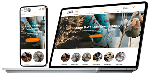
This wasn’t a typical redesign. They already had a strong identity and a loyal audience, but the online store didn’t match the personality that customers experienced offline. The site worked, but it lacked that spark that makes people want to explore, click, and ultimately purchase.
- About Us
About Us
We fuel business potential through world-class innovative technology and expertise.
Explore
A Tech Catalyst.
Our Agile Process
Discover our core values
Unlocking Digital Potential
400+
Successful Projects
25+
Expert Professionals
1M+
Lines of Code Written
4
Global Presence
15,000+
Dedicated Hours
100%
Client Retention
- Services
Gain a Clear Understanding of Our Services
A complete software development company using the latest technologies to create top-notch digital products that stand out in the industry with an innovative team.
Build websites that smoothly combine style and function for a strong online presence.
Create secure and easy-to-navigate online stores to make shopping enjoyable and safe.
Craft websites that turn your ideas into interactive experiences to captivate and impress visitors.
Bring your ideas to life on iPhones and iPads and deliver apps that resonate with users.
Designing apps for Android devices that win over users with their functionality and appeal.
Create apps that gracefully perform on both iPhones and Androids and ensure a smooth experience.
Inject creativity into brands with visually stunning logos and captivating visual elements.
Elevating websites with designs that are easy to use and visually pleasing to visitors..
Direct the spotlight towards your website by securing a prominent position through top search engine rankings.
- Expert UI/UX Web Design Services by Codener
- Elevate Your Brand with Custom Graphic Design Services by Codener
- eCommerce Website Design & Development London, UK Agency
- IOS App Development
- Leading Flutter App Development Company | UK USA
- Your Trusted ReactJS Web Development Company
- Trusted Shopify Development Agency -Codener
- Android App Development
- Professional and Experienced SEO Services Agency | UK USA
- Case Studies
Case Studies
A full-cycle software and mobile app development company with a world-class team of innovators.
Strengthen E-commerce Marketing with Codener’s UI/UX Excellence. From low traffic to flourishing business growth.
Redesigned publishing website boosts author engagement, trust, and lead generation through storytelling
Leading Sustainability in Engineering with Codener’s Web Redesign, enhancing visibility, user engagement, and eco-friendly branding.
Custom WordPress website establishes digital presence for national business brokerage and commercial sales firm
Custom WordPress site builds trust, drives leads for Australian SaaS payment automation platform
Figma-powered UI/UX redesign delivers cohesive, scalable design system for financial rewards platform
- Blogs
- Careers
- Contact Us
One Audit. Endless Growth.
The Ultimate SEO Checklist for Shopify Store Owners
- About Us
About Us
We fuel business potential through world-class innovative technology and expertise.
Explore
A Tech Catalyst.
Our Agile Process
Discover our core values
Unlocking Digital Potential
400+
Successful Projects
25+
Expert Professionals
1M+
Lines of Code Written
4
Global Presence
15,000+
Dedicated Hours
100%
Client Retention
- Services
Gain a Clear Understanding of Our Services
A complete software development company using the latest technologies to create top-notch digital products that stand out in the industry with an innovative team.
Build websites that smoothly combine style and function for a strong online presence.
Create secure and easy-to-navigate online stores to make shopping enjoyable and safe.
Craft websites that turn your ideas into interactive experiences to captivate and impress visitors.
Bring your ideas to life on iPhones and iPads and deliver apps that resonate with users.
Designing apps for Android devices that win over users with their functionality and appeal.
Create apps that gracefully perform on both iPhones and Androids and ensure a smooth experience.
Inject creativity into brands with visually stunning logos and captivating visual elements.
Elevating websites with designs that are easy to use and visually pleasing to visitors..
Direct the spotlight towards your website by securing a prominent position through top search engine rankings.
- Expert UI/UX Web Design Services by Codener
- Elevate Your Brand with Custom Graphic Design Services by Codener
- eCommerce Website Design & Development London, UK Agency
- IOS App Development
- Leading Flutter App Development Company | UK USA
- Your Trusted ReactJS Web Development Company
- Trusted Shopify Development Agency -Codener
- Android App Development
- Professional and Experienced SEO Services Agency | UK USA
- Case Studies
Case Studies
A full-cycle software and mobile app development company with a world-class team of innovators.
Strengthen E-commerce Marketing with Codener’s UI/UX Excellence. From low traffic to flourishing business growth.
Redesigned publishing website boosts author engagement, trust, and lead generation through storytelling
Leading Sustainability in Engineering with Codener’s Web Redesign, enhancing visibility, user engagement, and eco-friendly branding.
Custom WordPress website establishes digital presence for national business brokerage and commercial sales firm
Custom WordPress site builds trust, drives leads for Australian SaaS payment automation platform
Figma-powered UI/UX redesign delivers cohesive, scalable design system for financial rewards platform
- Blogs
- Careers
- Contact Us