Negative space in design is like the air we breathe, it’s invisible, yet vital.
Imagine entering a room so cluttered with furniture, books, and trinkets that it’s impossible to relax. Your mind craves order, simplicity, and a moment to breathe. That’s precisely what negative space provides in design—a sense of clarity and focus amidst the chaos.
Negative space, often called “white space,” isn’t just empty space. It’s the foundation that makes every design element stand out, guiding the eye and creating balance.
By the end of this blog, you’ll discover how to leverage negative space to elevate your designs, making them more functional, aesthetically pleasing, and professional.
What is Negative Space?
Negative space, also referred to as white space, is the area left intentionally unmarked in a design. It’s not confined to being white or blank—it can include colors, patterns, or textures that act as the background or gaps within a layout.
There are two primary types of negative space:
- Macro Space: The larger, unoccupied areas around elements like text blocks, images, and buttons.
- Micro Space: The smaller gaps within elements, such as the spacing between letters, lines of text, or icons.
Think of negative space as the “breathing room” for your design—it defines boundaries, enhances connections, and ensures each element gets the attention it deserves.
For instance, logos like FedEx cleverly use negative space to create hidden meanings, such as the arrow symbolizing precision and movement. In web design, a minimalist layout with ample negative space often enhances user engagement by making navigation intuitive.
Why is Negative Space Important?
Negative space does more than just make a design look clean; it fundamentally shapes the user experience.
Imagine trying to read a paragraph with no line breaks or margins—it would be exhausting. Negative space prevents this fatigue, making content easier to absorb.
Too many elements can overwhelm users. Strategic use of negative space removes distractions, ensuring your audience focuses on what matters most.
Supports Gestalt Principles:
Negative space influences how users perceive and group elements. For example, items separated by adequate space appear distinct, while those placed close together seem related.
Key Benefits of Negative Space:
– Guides the Eye: Directs the viewer’s focus toward important information.
– Focuses Attention: Highlights essential elements, such as calls-to-action.
– Adds Elegance: Creates a refined, professional aesthetic.
As graphic designer Milton Glaser said,
The more minimal the art, the more essential the message.
Common Misconceptions About Negative Space
Confusion About the Term
The word “negative” often carries a misleading connotation, making it seem like something undesirable or unnecessary. However, in design, negative space refers to the purposeful emptiness that enhances the overall structure and flow. It’s not about absence but about creating balance and clarity. Understanding this can help designers and clients see it as a valuable tool rather than wasted space.
Overloading the Design
It’s tempting to cram every available inch of a design with elements, thinking it maximizes value or communicates more. This approach often backfires. Overloaded layouts overwhelm users, making navigation and comprehension difficult. Negative space provides breathing room, ensuring that the most important elements stand out while reducing cognitive load.
Color Misconception
Despite its alternative name, “white space,” negative space isn’t restricted to white backgrounds. It can be any color, texture, or pattern—even a background image. What matters is its role in separating or framing elements, not its appearance. Recognizing this flexibility allows designers to adapt negative space creatively across diverse visual styles.
Minimalism vs. Negative Space
A common mix-up is equating negative space with minimalism. While minimalism uses negative space as a core principle, negative space itself can exist in a range of styles, including complex or vibrant designs. It’s about structuring elements effectively rather than stripping them away entirely.
Functionality Sacrifice
Some believe that using negative space means reducing functionality or content. On the contrary, it enhances usability by ensuring users can easily navigate and interact with the design. Thoughtfully applied negative space balances aesthetics and functionality, offering clarity without sacrificing purpose.
Ignoring Micro Space
While macro space—the space around major design elements—often gets attention, micro space within and between smaller elements like text and icons is equally crucial. Poorly considered micro space can hinder readability and disrupt visual flow, even in otherwise well-designed layouts.
Practical Tips for Using Negative Space Like a Pro
Using negative space effectively is a key element of design that can transform an ordinary layout into something extraordinary. By carefully considering how to use the empty areas around, between, and inside elements, you can create designs that are not only aesthetically pleasing but also functional. Here are some practical tips for using negative space like a pro:
Start with a Plan
Before you start placing elements on the page, it’s crucial to have a clear plan. Prioritize your content to ensure a balanced layout. Think about what needs to be the focal point of your design and what can remain secondary. Negative space will help to emphasize these focal points by allowing them room to breathe and stand out. A well-organized layout with clear priorities helps guide the user’s eyes smoothly through the content, making it easier to digest.
Master Typography
Typography and negative space go hand in hand. To make text easy to read and pleasant to the eyes, it’s essential to manage the space around it thoughtfully. Proper line spacing, kerning, and padding can make a world of difference. Too little space between lines can make text feel cramped, while too much can disrupt the flow. Micro space, the small gaps within letters or between text blocks, also plays a crucial role in improving readability and visual appeal. Adjusting these elements ensures your typography isn’t just functional but also a work of art.
Create Visual Hierarchy
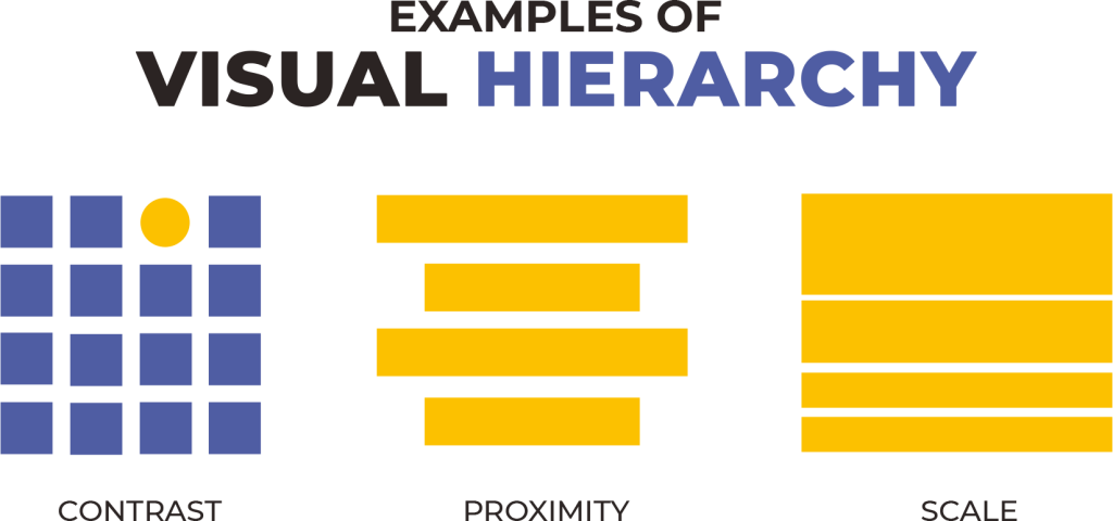
Visual hierarchy is key to guiding your audience’s attention and ensuring they interact with your content in the right order. Negative space helps highlight important elements by giving them more prominence in the design. By surrounding crucial elements with plenty of empty space, you create a clear focal point. Make sure not to overcrowd the page with too many competing elements; this can confuse users and detract from the primary message you want to convey. Focus on what’s most important and let the negative space do the rest.
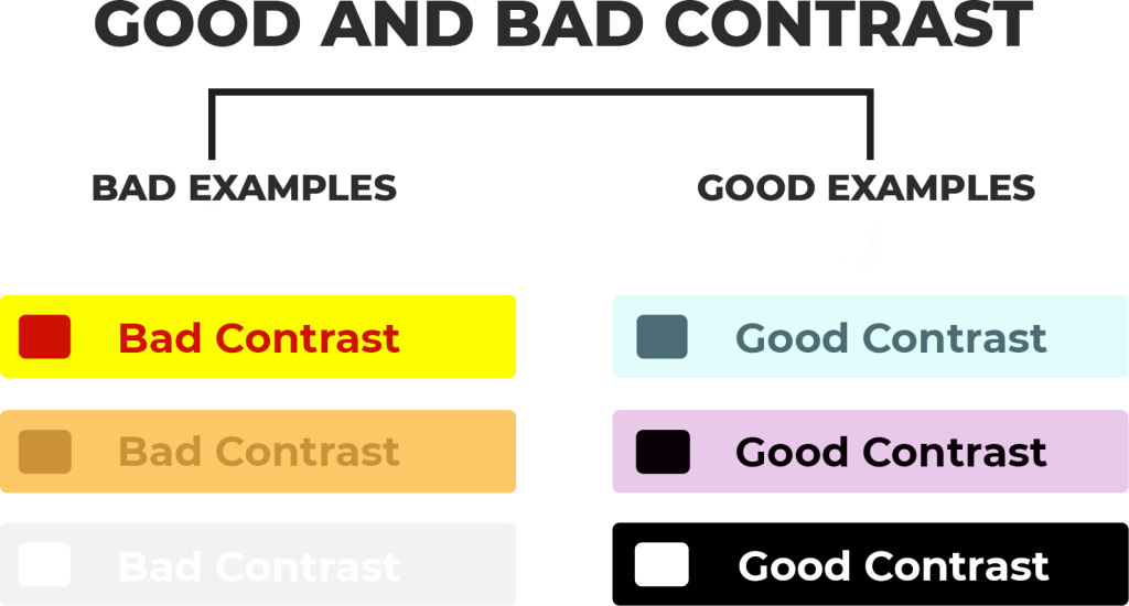
Leverage Contrast
Backgrounds, images, and colors can act as dynamic negative space when used creatively. Instead of relying solely on blank white areas, you can introduce texture, patterns, or subtle gradients to create depth. These elements can enhance the composition and make the core elements of your design stand out even more. Contrast between the background and foreground helps emphasize your main content and adds a sense of balance.
Design for Clarity
One of the biggest mistakes in design is overcrowding a page with too many elements. When this happens, the user is overwhelmed, and the message gets lost. Negative space allows your design to breathe, preventing unnecessary distractions. The key is to use space to break up content, making it easier to scan and comprehend. Whether you’re designing a webpage, an app, or a print ad, ensure that there’s enough white space around content blocks to enhance legibility and improve the user’s experience.

Examples of Negative Space Done Right
Now that you have a solid understanding of how to use negative space, let’s look at some real-world examples of designs that masterfully employ this technique
Logos
Some of the most iconic logos in the world are prime examples of how negative space can be used creatively. Think of the FedEx logo, with the hidden arrow between the “E” and “X”—a clever use of negative space that makes the logo more memorable. Similarly, the World Wildlife Fund (WWF) logo uses the black and white space to shape the figure of a panda, turning what could have been a simple design into a powerful visual.

Web Pages
A great website design uses negative space to balance content, ensuring it doesn’t feel too crowded. Take Apple’s homepage as an example. The minimalistic layout allows each product to stand out individually, while the negative space helps guide the user’s focus. The simple, clean design enhances the user experience by making the page easy to navigate and pleasant to look at. Every product has enough room to breathe, making the website feel elegant and user-friendly.

Mobile Apps
Minimalist design is a hallmark of many successful mobile apps. Look at the interface of Google’s Material Design—it uses negative space effectively to create a clean, uncluttered layout that’s intuitive and easy to navigate. The app’s simple, geometric elements and generous use of white space make the app feel less overwhelming, guiding users effortlessly to their next action.
Illustrations
Illustration work is another area where negative space can shine. Consider the use of empty space in editorial illustrations. The image of a moonlit landscape, for example, can use the dark sky as negative space to make the subject of the illustration—like a silhouetted figure—stand out more. By strategically using empty space around the subject, the illustrator adds depth, atmosphere, and meaning to the image, transforming a simple illustration into a captivating visual story.
Pitfalls to Avoid
When working with negative space, it’s important to avoid some common pitfalls that can hinder the effectiveness of your design. Here are three key points to keep in mind:
- Poor Prioritization: Information architecture is crucial when designing layouts. Without a clear understanding of the hierarchy of your content, negative space may not be used to its full potential. Properly prioritize the most important elements on the page and ensure that the negative space helps guide the user’s attention towards them. Without this foundation, too much focus on empty space may result in confusion rather than clarity.
- Overuse of Negative Space: While negative space is essential for creating balance, too much of it can dilute the focus of your design. If the design is overly sparse, it can cause important elements to appear lost or disconnected from the overall layout. The trick is to find a balance where negative space supports and emphasizes your content without overshadowing it.
- Ignoring User Needs: Ultimately, design is about serving the user. If negative space is used purely for aesthetic reasons but doesn’t align with the user’s needs or the functionality of the page, the design will fall short. Always consider how the space will enhance the user’s experience, making navigation intuitive and the information easy to digest. Functionality should always be prioritized, ensuring that negative space doesn’t obstruct the user’s ability to achieve their goals on the page or app.
Tools and Resources for Designers
Recommended Tools:
To effectively implement negative space in your designs, you’ll need the right tools to bring your vision to life. Here are a few that are widely used by professional designers:
- Figma: A versatile, web-based design tool that allows you to create layouts, wireframes, and mockups with precision. Figma offers a variety of features that can help you manage and manipulate negative space effectively.
- Adobe XD: Known for its powerful prototyping features, Adobe XD is a favorite for designing user interfaces and websites. Its flexible grid systems and spacing tools make it easier to manage both macro and micro spaces within your design.
- Sketch: Popular for UI design, Sketch is another excellent tool for organizing negative space in layouts. It offers clean vector-based design tools, ensuring that your spacing adjustments are seamless and precise.
- Typography Tools: Spacing adjustments, including line height and letter spacing, are key to making the most of negative space in text-heavy designs. Tools like FontForge, Glyphs, or Typecast can help you fine-tune typography to ensure it’s readable while still leaving plenty of room for visual breathing.
Resources:
Designing with negative space is a skill that improves with practice and learning. Here are some excellent resources to deepen your understanding:
Resource | Description | Platform/Source |
|---|---|---|
| Smashing Magazine | A comprehensive blog covering design principles, including articles on negative space and layout tips. | Smashing Magazine |
| A List Apart | Focuses on web design and user experience, with articles on using negative space to enhance layouts. | A List Apart |
| Coursera | Offers various courses in graphic design, web design, and UI/UX, including lessons on managing negative space. | Coursera |
| Skillshare | Provides design courses that teach layout and typography, including handling negative space. | Skillshare |
| LinkedIn Learning | Offers specific courses on typography, layout, and design principles, with emphasis on space management. | LinkedIn Learning |
| YouTube Tutorials | Step-by-step design tutorials that walk through the process of using negative space in different types of design. | YouTube |
| Designmodo | Features tutorials, articles, and resources related to web design, including negative space techniques. | Designmodo |
| UX Design | A platform with articles and tutorials on user experience and the practical application of negative space. | UX Design |
Wrapping Up
Negative space isn’t just “empty space” in your design—it’s a powerful tool that can make your designs stand out. When used well, it helps guide your audience’s attention, creates balance, and makes your work look polished and professional.
Whether you’re designing logos, websites, mobile apps, or illustrations, negative space is key to a clean, user-friendly layout. It’s not about having less content but about arranging everything so that it’s easier to navigate and more visually appealing.
Next time you design something, remember the power of negative space. By using it thoughtfully, you’ll create designs that are both beautiful and functional.
Reach out to us if you need help bringing your design ideas to life. Codener has a talented team of designers who excel in creating clean, modern, and user-friendly designs.
